The rebrand
Long before I started on this project, Purple’s in-house design team, including designers across brand and product, collaborated with Instrument to create Purple’s new brand guidelines. Instrument is an amazing studio and did a killer job collaborating with the team to develop a new design system.
I was part of the team that implemented the new system, working cross-functionally with the brand, development, and product teams to launch the new styles, components, and pages. I frequently “pressure tested” designs, ensuring that they worked well. I noticed the load-in animations fell short and needed attention.
The ugly
“Why are these load-ins so awkward?” was the common sentiment from the product team. The subtle animations made it difficult to pinpoint exactly why the animations where so clunky, but eventually we called out the following issues:
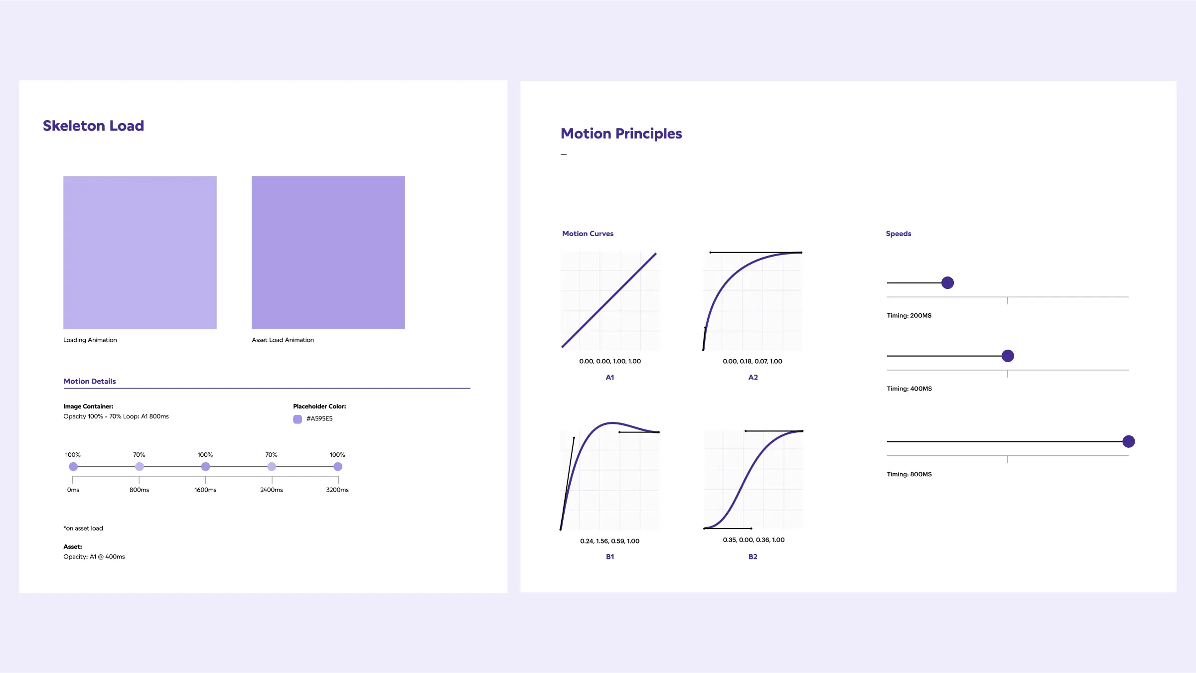
- The skeleton load wasn't working properly. This is really easy to miss, depending on the speed of the connection. With decent internet speeds, it could be a very short state at the beginning of the load.
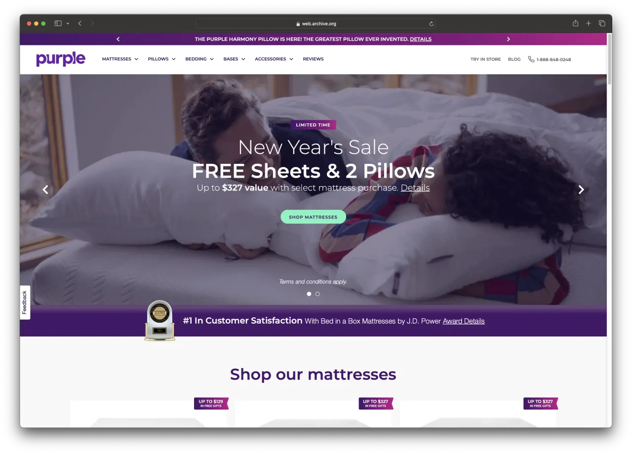
- The "swipe" load used for the images was jarring and disorienting, as it diverted attention away from the content.
- The type load animation needed attention as it didn't feel natural.
Overall, the current load-in animations felt too prominent, loud, and lacked a reason for the choices behind the elements.
Giving load-in’s some art direction
Ultimately, we wanted load-in animations that aligned with the Purple brand and voice, but didn't distract from the content on page.
My redesign began by asking, “What are we doing here at Purple?”. Purple sells better health and wellness—focusing on quality sleep. The product team was continuously inspired from the Purple bed itself. So, I decided to make the animations a little bouncy, but also soft and dreamy. They should feel good, but not have an overwhelming presence.
The changes
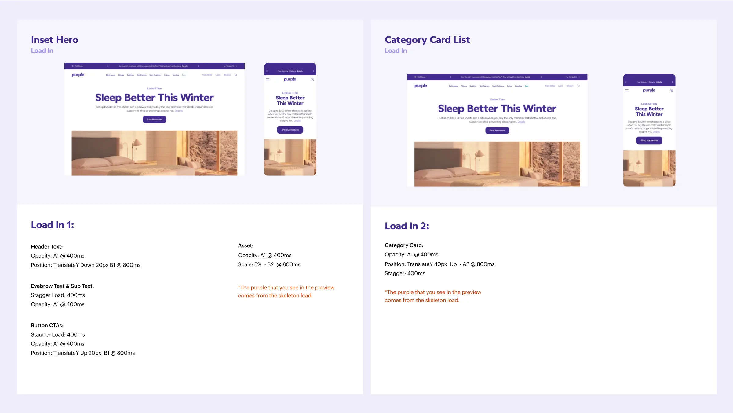
For the “Inset Hero component” I removed the swipe animation on the image and added the subtle text/button fade in. The header text slightly falls and rests above the copy text, while the CTA button bounces, as if on a mattress.
For the "Product Card" component, I removed the swipe animation and added fades for the images. I staggered the load times and added a very subtle bounce in the transition. You can find the specific specs for these components at the end of the case study.
The overall feel of the new animations doesn't distract from the content but adds interest to the load-ins.
The brand team was excited about the new brand touchpoints the animations incorporated, and the development team was excited about the code challenge the new animations would bring. ;)
The Nitty Gritty
Diving into the more technical aspects of UI motion was really fun. I think the industry, including myself, relies heavily on Figma's prototyping tools to add animation in UI—which can be limiting. I was very mindful of timing and custom motion curves for the load-ins, which felt like crafting the experience rather than adding something quickly to be done with it.
Below is the documentation we handed off to the development team, which described the specifics of timing, custom motion curves, and staggered loads that created the final animations. For example, the B1 motion curve created the subtle bounce seen in the CTAs of the Inset Hero component.