Humble Beginnings
In 2022 I was hired at Breeze Airways as their sole product designer. The company had been flying for two years and doubling in size each year. I had worked with both startups and corporations in the past, but I had never experienced somewhere that was quickly growing into a large organization while trying to mature out of past “start-up” practices. It came with a lot of process restructuring, feature launches, and pivoting to meet our growth needs.
I had the opportunity to improve on initial launch MVPs, as well as touch a lot of the web product in a very short amount of time.
Changing to Serve our Growth Requirements
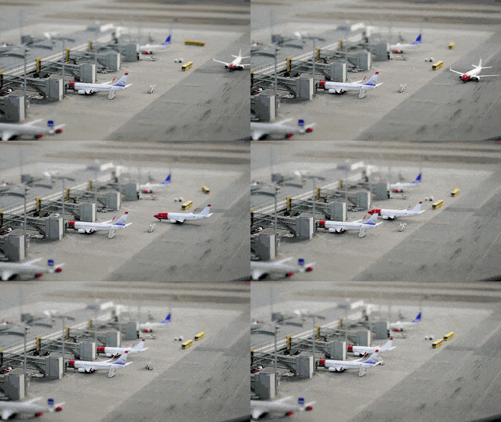
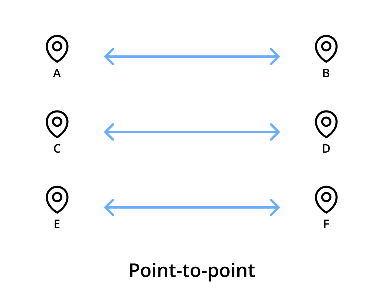
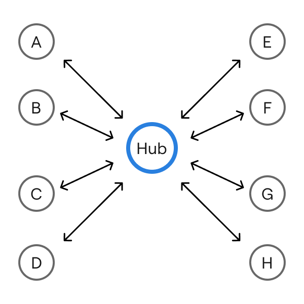
Breeze had been functioning as a point-to-point airline, which meant Breeze only sold and operated one-way flights without any connections or stops. This needed to change. Our fleet had grown and our customers wanted more options. That meant refactoring the whole digital product so we could support a “Hub & Spoke” model, meaning we could have connecting flights.
As a part of this larger effort, Breeze desperately needed to update how guests interacted and used the digital boarding passes.
Getting through the stressful boarding line
During field observations, it was clear the experience for passengers that had multiple people on their booking was pretty ugly.
Picture being called up by the gate attendant, your section is ready to board. You still feel the nerves of being in an airport, getting to your flight on time, and getting through security and now it's time to grab all of your carry ons and find your seat.
Your family shuffles to the line for the boarding. You see the line in front of you getting shorter and shorter as you struggle to navigate to your boarding passes on your phone.
Finally it's your turn to scan your boarding passes. On top of the initial nerves, the UI adds a ton of stressful friction. The QR codes aren’t easily accessible and navigating to other passes proves to be incredibly difficult—forcing you to use drop downs and scrolls for the additional required QR’s.
This description illustrates the issues we saw our guests go through everyday when using Breeze technology. Passengers were actively struggling with boarding. Not only that, but the gate attendants were begging our team to improve the boarding pass design.
Skeuomorphism is cool, but why here?
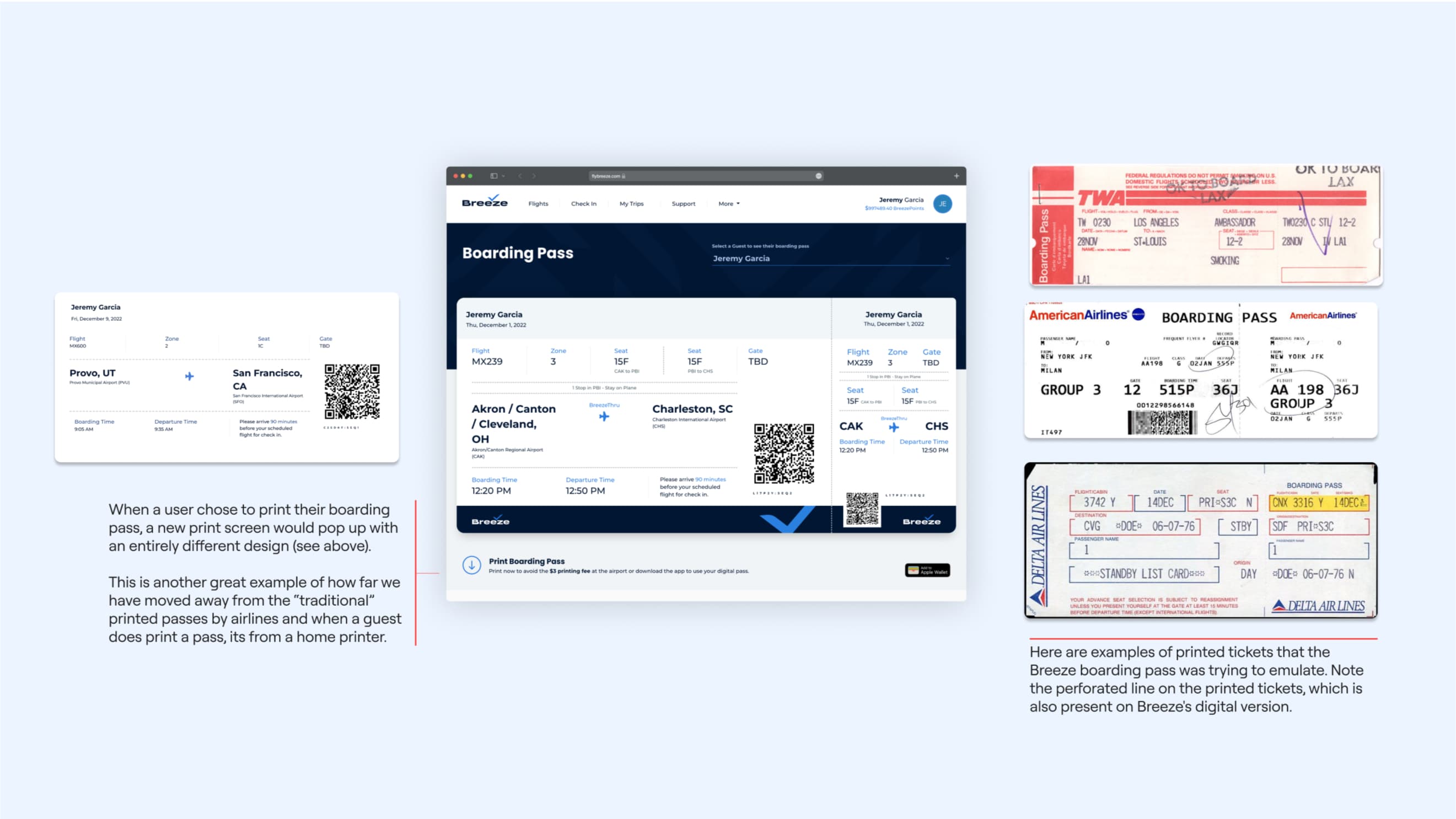
One of the more odd parts of the initial boarding pass design was the use of skeuomorphism. Skeuomorphism is where elements in a digital product mimic the appearance of real-world objects they are meant to represent. Basically, the boarding pass on screen looked like a real paper ticket.
The team felt like this was unnecessary and didn’t give much value to the user. Skeuomorphism can be helpful when describing a new digital experience, but digital boarding passes have become incredibly common and have many recognizable digital design cues.
Recognizing current trends
We did a quick competitive audit to analyze how the boarding passes are designed and organized. The competition validated the idea that there are common design cues and organization of digital passes used either on different operating systems or competitor’s apps.
Some of the notable design cues include:
- No skeuomorphism: None of the passes looked like a real paper ticket.
- Large QR codes: Most examples kept these above the fold of the screen.
- Readability of airport codes: Airport codes are some of the largest items on the boarding pass, so they should be easy to see and read.
- Simplicity: Simpler passes are more successful. They were easier to read and easier to use.
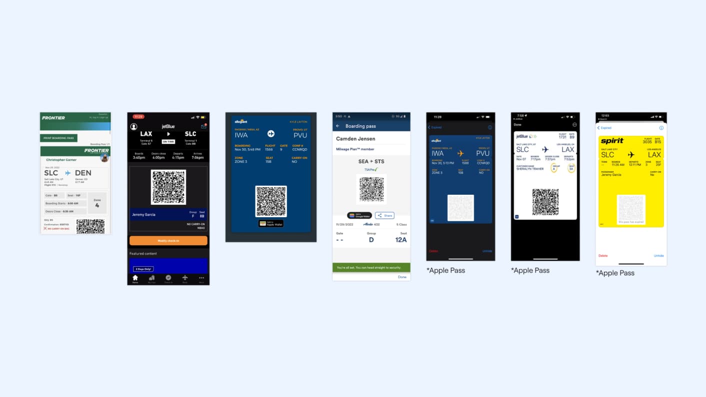
By adopting current digital design trends and moving away from unnecessary skeuomorphism, the new boarding passes can make for a better experience for our passengers and gate attendants.
The final design
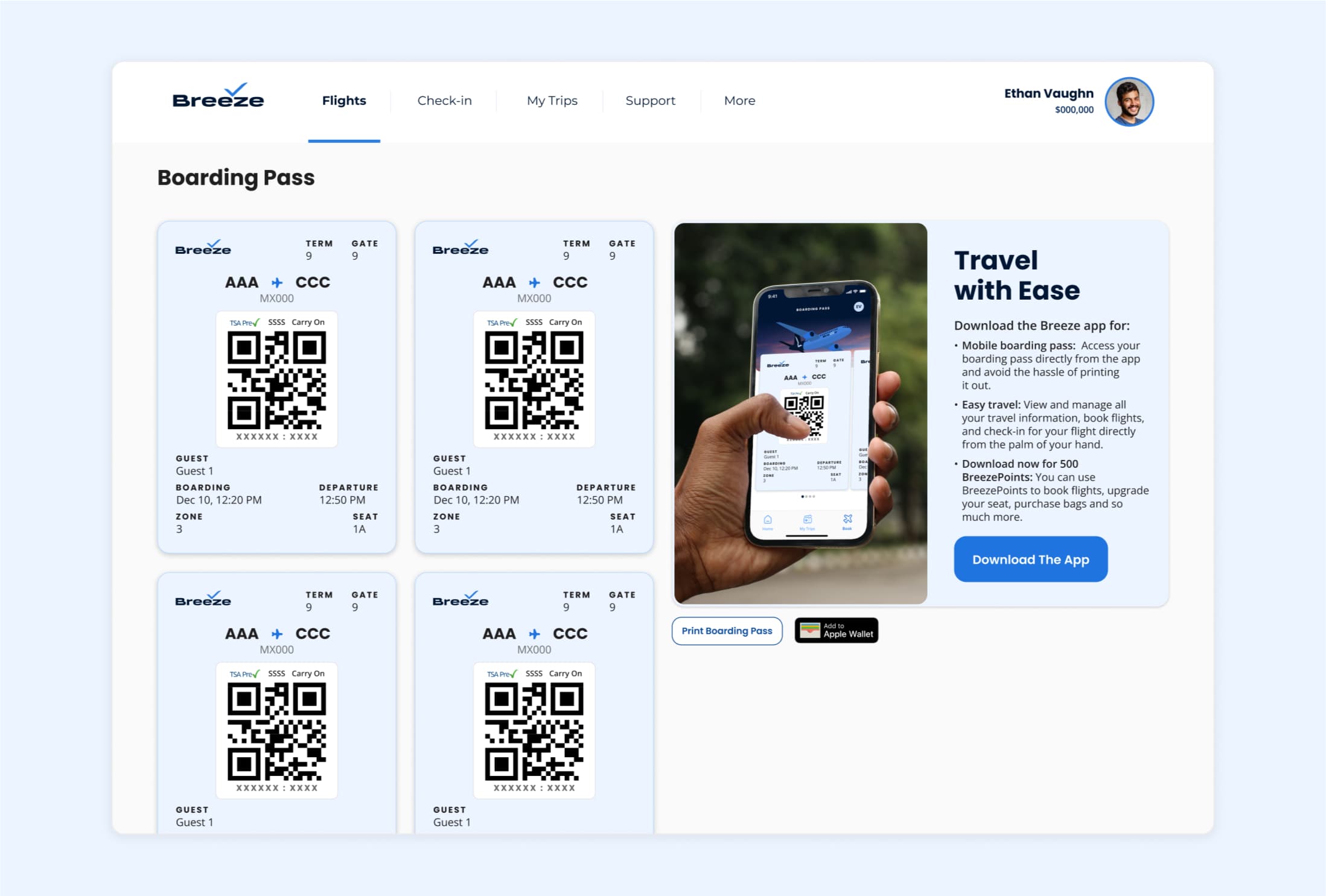
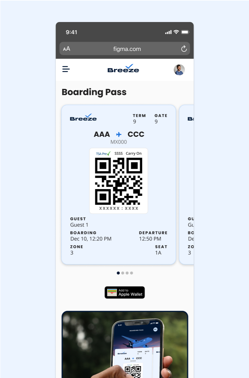
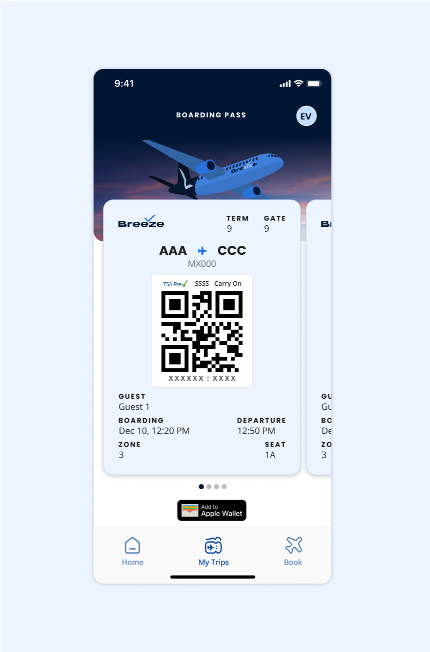
The new boarding passes are compact with an improved organization of information. Users are now able to easily access the QR code and navigate to additional passes when needed. This solution also works across desktop, mobile responsive and app.
Using the Boarding passes
When “going into the field” to test this new boarding pass, gate attendants expressed how grateful they were for the update. The boarding process was noticeably quicker and the new “swipe” interaction allowed passengers to quickly cycle through multiple passes.
Ultimately, this was an incredibly fun project to work on. It’s exciting to think that thousands of our passengers use this pass everyday and design played a huge role in making sure that experience was a good one.
